"How did you use new media technologies in the construction, research, planning and evaluation stages?"
LINK: https://youtu.be/ivye97-O568
Thursday, 12 February 2015

Evaluation: Question 3
"What have you learnt from your audience feedback?"
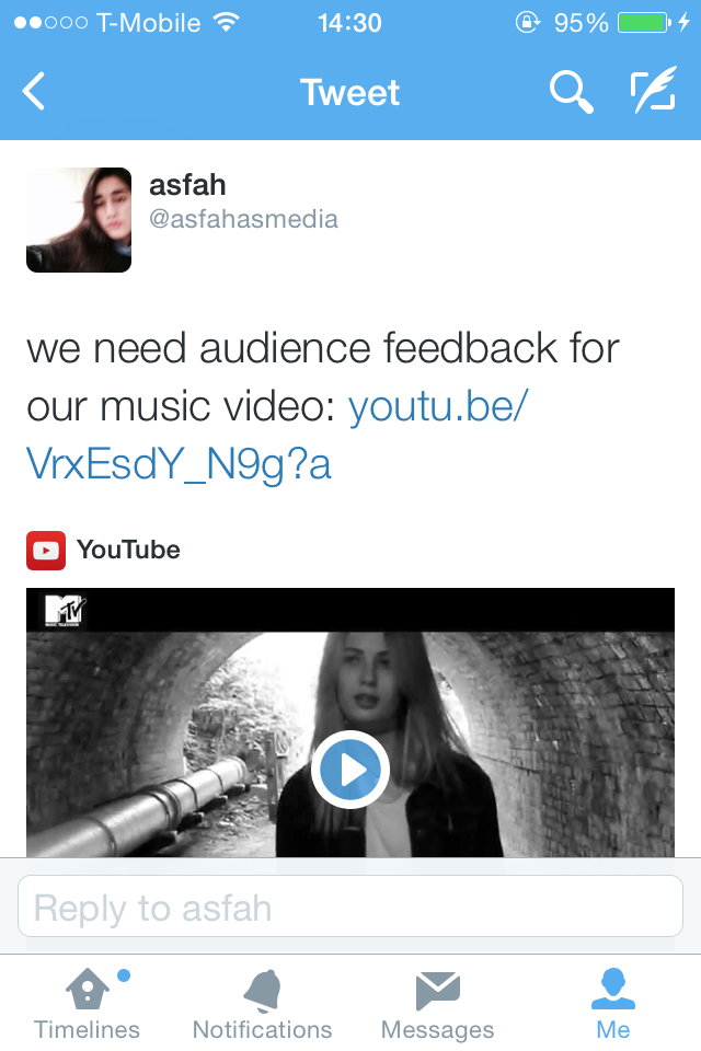 |
| Posting the link to Twitter |
To gain feedback on my completed music video, I posted the link onto Twitter as a source of interacting with an audience which was addressing people who were the same age as me. I selected 3 replies which I thought were positive and also constructive expressing their criticism, pointing out the pros and cons of the music video. Overall, the comments were positive, however one aspect of criticism which kept coming up was concerning the lip syncing of the artist against the track, which is something we couldn't fix due to our artist singing out of sync, (too fast or too slow).
 |
| Comment 1 |
 |
| Comment 2 |
 |
| Comment 3 - Part 1 |
 |
| Comment 3 - Part 2 |
 |
| Comment 3 - Part 3 |
Another source of feedback which we collected was from a younger demographic audience.
Quotes from audience feedback [younger demographics]
Overall generalising the audience feedback we received, our music video was successful, however it was apparent across the board that our weakest element within the music video was the 'lip syncing' problem which destroyed the flow of the video visually. Here are some direct quotes from the audience, "She wasn't in time with the singing.", "Lip syncing way out of time.", "She should move her mouth more because we can tell she's not singing.", "Lip syncing out a split second." One interesting comment that was stated was how we "shouldn't have done the lip syncing at all" which was a concept we never considered, however with this specific style of song, we thought having an artist singing was an effective way to go. Another form of criticism we received was that our artist didn't show enough emotion, "She doesn't have much expression.", "Facial expressions were really bad.","She should really act more so it looks more real.", "Girl doesn't have much expression." If we were to recreate this music video again, we would reconsider our casting options or make sure the artist knows the words to the song off by heart so that singing it with passion isn't a problem. The lip syncing is a vital part to a music video and I wish we could have altered it further, however it was too difficult due to or artist not singing emotionally - the realistic element of the artist singing creates a sense of flow.
On a brighter note, the positive feedback we received was mostly concerning the editing and filming of our video and how it matched well with the style of the song, which was pleasing to read. "Overall very good, with amazing filming and some very effective angles.","I think the video editing is amazing, professional video-editing.", "The bottle was the only colour shown and it looked good.", "I think the overlapping of the shots at the end is good and I liked the flare at the end", "I think the backwards tear was a good effect and I like how it was only used once.", "Cuts edited on the beat, smooth, makes it bolder.", "The scenes and angles are impressive.", "All the scenes and outfits match the song, which is good about a music video - the shots were two scenes merged together." - This comment clearly states our intention from the start, where we planned out two main locations and had the incentive of cutting back and forth throughout the video, following the generic conventions. Another feature which was appreciated by this younger demographics audience was the 'black and white' effect which we incorporated into our music video, "Black and white was very effective.", "I think the graphics compliment the song well", "The black and white gives a cool effect.", "I like how it's all black and white and kept changing scenery and the girl kept changing outfits." It's clear to say that this audience was fond of the creative, symbolic visuals which we constructed as it caught their attention
The comments also conclude towards 'why' we chose to include elements such as 'smoking' as it fit the feelings expressed by the artist within the lyrics of the song, suggesting that she's 'depressed' and how it's something you would expect in a 'grungy' music video, "Lighting the cigarette was really effective.", "Grunge theme", "It shows us alcohol and her smoking which may mean she is depressed.", "You know she's depressed as she's smashing glass on the floor, smoking, crying and her clothing." - These type of comments reinforce how the generic elements within each music genre is what the audience expects to observe while they are watching. Although the younger audience can pick out the themes included, I don't think they can relate to the video on a higher level as it is targeted at an older audience. One comment which also came up across all audiences is how "the video had a good story behind it" which shows that we constructed the right visual images to match the lyrics of the song and also made it aesthetically pleasing to watch. Looking back at all the audience research we collected, I think our music video was a success and wouldn't look out of place as a real music video which is viewed on music television channels such as MTV.
On a brighter note, the positive feedback we received was mostly concerning the editing and filming of our video and how it matched well with the style of the song, which was pleasing to read. "Overall very good, with amazing filming and some very effective angles.","I think the video editing is amazing, professional video-editing.", "The bottle was the only colour shown and it looked good.", "I think the overlapping of the shots at the end is good and I liked the flare at the end", "I think the backwards tear was a good effect and I like how it was only used once.", "Cuts edited on the beat, smooth, makes it bolder.", "The scenes and angles are impressive.", "All the scenes and outfits match the song, which is good about a music video - the shots were two scenes merged together." - This comment clearly states our intention from the start, where we planned out two main locations and had the incentive of cutting back and forth throughout the video, following the generic conventions. Another feature which was appreciated by this younger demographics audience was the 'black and white' effect which we incorporated into our music video, "Black and white was very effective.", "I think the graphics compliment the song well", "The black and white gives a cool effect.", "I like how it's all black and white and kept changing scenery and the girl kept changing outfits." It's clear to say that this audience was fond of the creative, symbolic visuals which we constructed as it caught their attention
The comments also conclude towards 'why' we chose to include elements such as 'smoking' as it fit the feelings expressed by the artist within the lyrics of the song, suggesting that she's 'depressed' and how it's something you would expect in a 'grungy' music video, "Lighting the cigarette was really effective.", "Grunge theme", "It shows us alcohol and her smoking which may mean she is depressed.", "You know she's depressed as she's smashing glass on the floor, smoking, crying and her clothing." - These type of comments reinforce how the generic elements within each music genre is what the audience expects to observe while they are watching. Although the younger audience can pick out the themes included, I don't think they can relate to the video on a higher level as it is targeted at an older audience. One comment which also came up across all audiences is how "the video had a good story behind it" which shows that we constructed the right visual images to match the lyrics of the song and also made it aesthetically pleasing to watch. Looking back at all the audience research we collected, I think our music video was a success and wouldn't look out of place as a real music video which is viewed on music television channels such as MTV.
Evaluation: Question 2
"In what ways does your media product use, develop or challenge forms and conventions of real media products"
CLICK LINK BELOW TO VIEW QUESTION 2 OF EVALUATION:
LINK: https://prezi.com/wd_pk3-cak8j/evaluation/?utm_campaign=share&utm_medium=copy
CLICK LINK BELOW TO VIEW QUESTION 2 OF EVALUATION:
LINK: https://prezi.com/wd_pk3-cak8j/evaluation/?utm_campaign=share&utm_medium=copy
Evaluation: Question 1
"How effective is the combination of main product and ancillary texts?"
LINK: https://soundcloud.com/simren6/how-effective-is-the-combination-of-our-music-video-and-digipak
Referring in detail to some points stated in the audio recording:
The main purpose of a music video is to entertain the audience and regarding the ancillary task it is often seen as a form of marketing and advertising the artist - raising awareness of their profile. Seeing a poster for one of my favourite bands in a magazine will make me want to watch their music video and then buy / stream their song, this generates money for the institutions. The music video and digipak products work well together as there is always strong elements which interlace with each other, often making them look visually similar is a good way of marketing as it makes it clear to the audience. Referring back to the question, I think the combination of both products is extremely effective when talking in my personal opinion as it works and audiences buy into the advertising which is composed and eventually end up purchasing the album and looking up the music video on youtube.
LINK: https://soundcloud.com/simren6/how-effective-is-the-combination-of-our-music-video-and-digipak
Referring in detail to some points stated in the audio recording:
The main purpose of a music video is to entertain the audience and regarding the ancillary task it is often seen as a form of marketing and advertising the artist - raising awareness of their profile. Seeing a poster for one of my favourite bands in a magazine will make me want to watch their music video and then buy / stream their song, this generates money for the institutions. The music video and digipak products work well together as there is always strong elements which interlace with each other, often making them look visually similar is a good way of marketing as it makes it clear to the audience. Referring back to the question, I think the combination of both products is extremely effective when talking in my personal opinion as it works and audiences buy into the advertising which is composed and eventually end up purchasing the album and looking up the music video on youtube.
Friday, 12 December 2014


Thursday, 11 December 2014


Tuesday, 2 December 2014
Digipack Research: Typography
 |
| London Grammar Typography |
These are the four best fonts which we found:
1. Orator Std
2. Blair ITC Light
3. Marquisette BTN Lined
4. Agency FB
I created this exemplar sample of each typeface to visually see which one stands out the most for us, in terms of how it matches and links to our artist [London Grammer]:

In the end, we decided to choose the 2nd font: Blair ITC Light
For the album name, we spaced the letters out to make it look more proportional to the band name which is composed above. In terms of colours, we stuck to our black and white theme, however for the album name we chose a deep shade of red which matches elements of our back cover of the red glass bottle which is also featured in our music video.
I created this exemplar sample of each typeface to visually see which one stands out the most for us, in terms of how it matches and links to our artist [London Grammer]:
In the end, we decided to choose the 2nd font: Blair ITC Light
For the album name, we spaced the letters out to make it look more proportional to the band name which is composed above. In terms of colours, we stuck to our black and white theme, however for the album name we chose a deep shade of red which matches elements of our back cover of the red glass bottle which is also featured in our music video.
 |
| Testing Out Typeface. |
Sunday, 30 November 2014
Digipak Research: Conventions of Album Covers & Magazine Adverts
Conventions of Album Covers:
Front


Front
 |
| Peace - Front Album Cover |
- The main image on the front cover is usually a photograph of the artist / band or it's an illustrated symbol or image, representing their unique style.
- The name of the artist is often portrayed in a sharp eye catching typeface, making it clear to the audience.
- In terms of colour, for a pop album you would expect bright candy colours whereas for an indie rock album the colours would be particularly dark and dull e.g. black. A simplistic colour scheme is often composed to keep it simple yet effective.
- A bold simplistic font for the album name - the name of the album conventionally has a relation to what the songs are about or the implication / interpretation behind it.
- The font style can also be a representation of the genre of music which the artist or band belongs to.
- Bands often compose an iconic logo on their album to represent them, which they may also use on their promotional material e.g. tour adverts.
 |
| Drake - Back Album Cover |
- The songs / track list are conventionally listed in a centralised composition.
- Band promotion information e.g. their website.
- The back image typically links to the front image of the album cover.
- Copyright material / issues, to prevent anything be stolen.
- A bar-code is always present on the back cover for purchase and financial purposes.
- The distributor of the album is always listed and commonly have their logo portrayed.
- The year the album was made e.g. 2014.
- Simplistic image which matches the rest of the album theme.
- Where the CD is placed is often left blank, however some albums have an image or colour shade, which interlaces all of the album together.
- The release date of the album or the phrase "OUT NOW"
- An image of the album cover - promoting it clear to the audience.
- The name of the band and album are highlighted in a bold font, usually at the top of the page.
- Links to the artist / band social media websites.
- Artist / band website, where the audience can access more information about them.
- Reviews / Ratings of the album, praising it - this encourages the audience to buy it.
- Record label logo.
- Institutional logos of where you will be able to purchase the album (shop/online), for example, iTunes, HMV and Amazon.


Friday, 28 November 2014
Digipak Research: Magazine Advert Information
As London Grammar are an indie band and not recognized globally, the venues they play at are relatively small. They would not be playing at venues like the London O2 Arena, as they are for artists who are more mainstream. We researched where they played at earlier this year around the UK in order to incorporate accurate information onto our magazine advert, as we want to include upcoming tour dates around the UK.

Thursday, 27 November 2014

Wednesday, 26 November 2014
Digipak Research: Advert - Peace & Wolf Alice

This magazine advert displays how the band's iconic 'peace' logo is used as promotional material and can be seen as a form of iconography. Symbolism is a typical feature which is composed on promotional advertisement for bands as it creates a sense of belonging. In our music video, we captured a range of footage which composed iconic abstract representations which symbolise the feelings of the artist. Personally, I think it would look effective to integrate a sharp photo of e.g. 'the red wine bottle' we used, to represent the artist's deep feelings and emotions which are highlighted throughout the song.

I really love the simplistic approach to this magazine advert, as the thin handwriting styled font is centralised along the top against the pale shade of pink which connotes a subtle feeling. In the centre of the advert, a polaroid image is displayed of the band which expresses a vintage and old fashioned composition. The tour dates are composed in a clear bold font in a linear, centralised layout which I think looks effective. The focal point within this magazine advert is the photograph portrayed and I like how the background creates a border for it to stand out. For my magazine advert, I want to create a similar layout, following the concept of keeping it simplistic, but effective.
Tuesday, 25 November 2014

Monday, 24 November 2014


Subscribe to:
Posts (Atom)